While shuffling through old images in the process of assembling yesterday's blog post, I couldn't help but notice a few elements that piqued my interest enough to merit comment on this forum. Diving even so much as a year back into days since passed, it quickly became apparent that some of the subjects used in the old images were the subjects of new visual constructs of the past few months. Of course certain subjects are apt to beg for re-visitation, but a pleasant discovery is what I perceive as the clear and marked improvement I've managed to make in my visual styling between then and now.
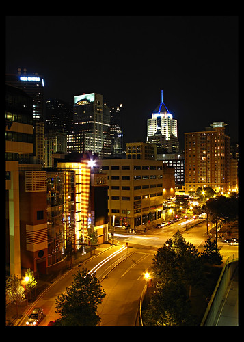
During my annual trip to Pittsburgh, I snapped this image to the left with my old compact champion, the then-new Canon G10. The compact-yet-rugged design was the object of my affection for some time, and although the ultimate image quality never deeply satisfied, the experience of shooting the camera was thrilling. Just a year later I made the unfortunate error of selling it, but at least the purchaser was my good Pittsburgian friend, Roman, who I trust to always put it to good use.
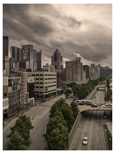
Let pass 2 years, and I am in Pittsburgh in late June, snapping an almost identical photo, but at a different time of day and with a VERY different result. Yet another image produced from a compact, but unlike the G10 the final image of the XZ-1 produced actual satisfaction and not subtle resentment. It stormed the entire time I was in the city, and something about stormy weather produces the most incredible skies. Two years back and I was still so enamored with night photography that I didn't know what a sky looked like.
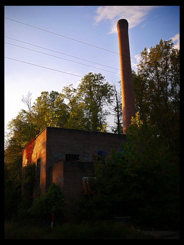
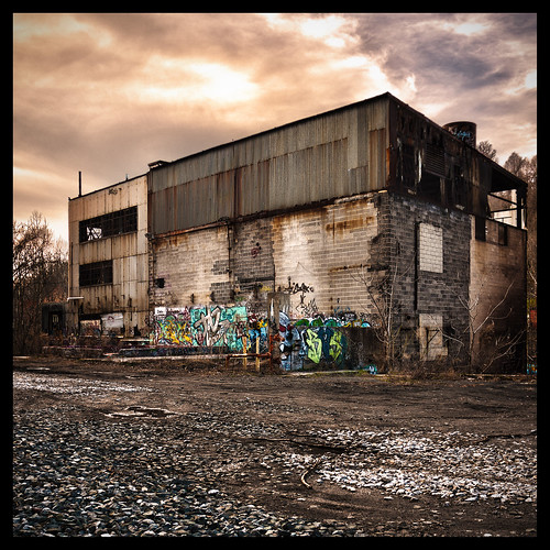
This image was the product of my first trip to a certain abandoned property to which I would return many times. After a long trek down a railway deep in the woods, around a few bends, over a bridge and through a dank, drippy tunnel, this boiler building was the first sign that the ultimate destination had finally been reached. Having walked for so long with nothing yet to show for it, I readily grabbed at my camera and entered a hazed snap shooting mode, photographing things around me but with little attention paid to delicate metering of alignment. Still, the building was the icon of the destination reached to me, and so I shared the photo with the appropriate community of culture fringe aficionados.

The next attempt was met with much greater success (or so I believe/feel/well hey, that's, like, just your opinion, man). All lines converged on a vanishing point in the center and above the image. Exposure was metered to evenly permeate the scene. And this image marked my first foray into the desaturated coloring that would define my images for some time. Granted, this image was taken in the same month as the original, and my habit to over-vignette hadn't quite been quelled, but this image certainly marks at least the beginning of several improvements rapidly made over the Winter months of 2010.
Sometime in October of last year I managed to acquire a wired shutter remote for my GF1 to allow for more stable image capture. Unfortunately, the flexibility of the camera's automated bracketing instead directed me to pursue the most loathed of faux artistic gimmicks, wide-spectrum HDR. It took no time before every "single" image was the hideous mashing of at least 7, typically with a dynamic range spanning from -2 2/3 to +2 2/3. The lack of contrast made the images horrible. Color was laughable and cartoonish. But my engineer goggles were glued to my eyes and somehow they passed as good images. This particular shot may be the worst offender.
Most folks countered their HDR disgust with judicious use of Photomatix. I, however, was cheap (and still am, come to think of it) and refused to invest money in something silly as a plug-in for Photoshop. Instead of taking the easy way out, I forced myself to learn how to make HDR look good with crude tools. Fine art painting with a drier lint brush, essentially. Shockingly, this image to the right represents the pinnacle of that pursuit. I relearned how to reintroduce measured contrast, adapted my desaturated style to subdue the pumped colors typical of HDR imaging and quickly learned that good HDR out of Photoshops integrated HDR tool required several HDR renderings be made, and each bracket-and-blended to generate an at all believably wide-dynamic-range image. Personally, I feel the image here to be a great success. A pain in the ass, but a great success.

Again, HDR obsession marked the processing of this image as well. It's not nearly as offensive as some of my early HDR attempts, but it's not interesting, either. Lack of contrast, a sacrifice to keep the sky looking evenly exposed, make the subject itself sag, especially given the kind of light that struck it that day. The image is poorly cropped, as well. Still, there is a measure of sentimentality associated with the subject. For several trips made to this location, I would come with my fellow photog, Ted, and we'd share a hookah in this little graffiti box (actually an elevator maintenance booth). Given the remote nature of the location, sunsets and their transition from twilight to complete dark were amazing to watch, and stargazing, a pastime I'd never indulged before due to the bright lights I'd grown accustomed to in city and suburban life, absorbed a good deal of our time and attention.

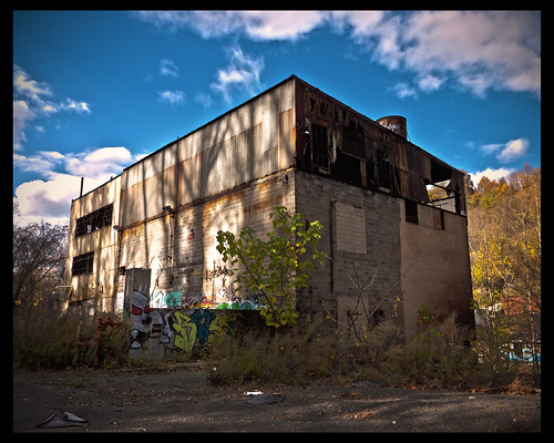
Just last week I revisited the locale and photographed the "fagbox" (as I came to call it on account of liberally applied "fag" tagging) mostly to see how it had changed since my last visit. Clearly, the graffiti took a bit of a nosedive in aesthetic. But from the compositional standpoint, the resultant image from last week's outing is many levels more appealing in the inherent aesthetic than the prior attempt. Most notably, I actually got closer and stopped worrying about exposing the sky is any specific way. The sky is not the subject, the box itself is. The idea is to make the viewer feel literally there, next to this edifice, in this environment of vandalism and decay. Color is pumped, but attractively so. It matches the presence the light and color had when actually on the scene. And the vignetting... well... okay, so I still amplify it a tad, but I also blame the lens for producing it as well. Not that it is necessarily bad for a lens to vignette, it's rather nice to have the corners darkened and centralize viewer focus where the subject really is. I'm not in the photography market for strictly true-to-life reproduction, after all.
All this nostalgia and looking back on my roots and the progress I've made really does make me far more excited about the future. I look forward to getting to review my own improvement again.


No comments:
Post a Comment